Remember the OneGoogle Bar? No? You see it every time you go to Google, its the header on the top of the page that gives you links to Gmail, Images, your apps, your notifications and of course your accounts. The OneGoogle Bar for many is their primary interface into many of Google’s apps and services. Others amongst you might never have known it was even there.
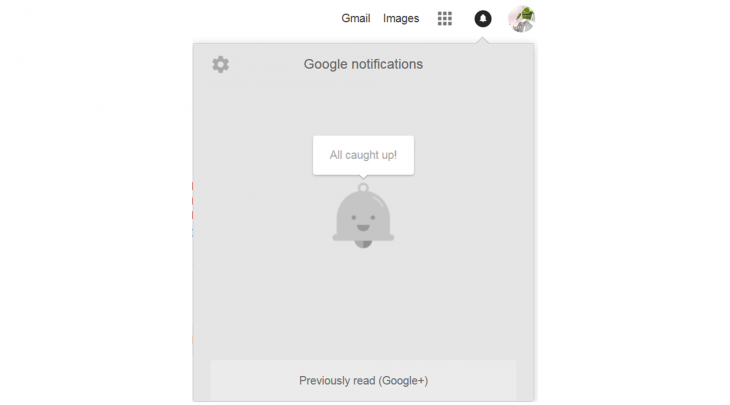
Google has had several iterations of the OneGoogle Bar over the years, and it seems that Google is at least considering another revamp, at least for the notification portion of the bar. The notification bar currently serves to give you access to notifications from Google+ (yeah it still exists and some of us even still use it), Chrome permissions, Google Photos and Spaces.
It’s always been odd that Google hasn’t integrated more services into the notification bell, or at least the option for more services, especially Hangouts which was an integrated component of Google+ until recently. Apparently, someone at Google also thinks that’s odd, as according to our information they are looking at both a redesign and an increase in scope for good old Mr Jingle’s home.
He’s the grey bell that tells you that you’re all caught up if there’s nothing in your notification list. Though, if you read on, he might not be long for this world — Google might be planning to get rid of him.
The plans as explained to us by sources familiar with the matter indicate that Google is looking to increase the number of services that get integrated into the Notification Bell, we can easily see services such as Gmail/ Inbox, Hangouts, YouTube, Google Drive, Reminders and perhaps even Google Now style cards making their way into the reconfigured notification system.
To achieve this Google is going to give the Notification Bell a few upgrades, initially, this will include a Material Design refresh, of course. Grouping notifications together per app, just like in Android Notifications, and just like in Android those notification groups can be expanded see the individual notifications from each service. Overall this approach makes sense and will be more consistent with other Google offerings. In order to minimise notification overload, each service will have its own toggle and settings that will be accessible right from within in the Bell itself.
We’ve managed to mock up a few screen shots based on what we know.
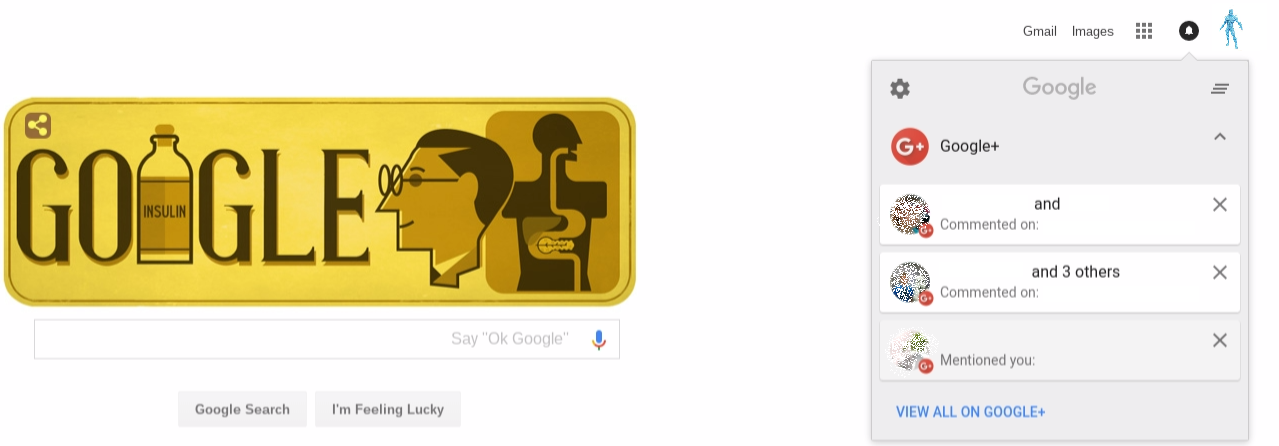
The above shows the new grouped notifications for Google+ (in this instance) with the individual notifications below, as you can see each ‘group’ can be toggled on or off. This toggle choice will be remembered between restarts,so if you always leave Spaces notifications toggled off you’ll only see the card for it, not all of the notifications under it.
You can also hit the “View all on Google+” (in this instance) button to be taken to that interface to specifically view and manage your notifications.
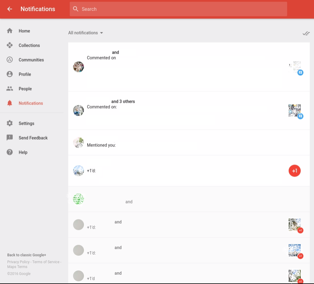
Each app will take you to a new interface in that service to allow you to view and manage your notifications for that specific app. At the top, you have the option of changing the view options between all, only new or already read notifications, similar to how other menus currently work.
It’s not all good news however, we’re reliably informed that in this update Google will officially retire Mr Jingles. Perhaps he isn’t materially enough, or maybe he’s planning on emigrating to Canada or New Zealand in light of recent events? Either way, if Mr Jingles does go to the farm it will be one less little bit of fun any whimsy , Mr Jingle used to celebrate many an occasion, still, maybe Google is growing up, perhaps that’s good?
This isn’t the biggest redesign in Google’s history. I think that will be the day Google Calendar finally goes material on the Web, however moving more of its core services into the common notification bell is a great step, and giving users control over what services use that, and how they appear is also fantastic.
Hopefully, when the new notification system is released it will adopt a little of Android’s actionable notifications allowing you to do more with those notifications right from within the panel. It would also be great if these notifications are synced across your account so it dismisses them across all of your connected devices.
According to our information, the new design will also be used for ChromeOS devices replacing the current system in the bottom right of the system tray. Of course, as with all Google experiments, this could have been an old and defunct program and it may never even see the light of day. However, the move makes so much sense we think it may just roll out to all, one day.