If you’re using the stock Google Phone and Contacts apps on your phone, then you may have noticed a bit of a visual refresh is rolling out right now giving the app a fresh new look.
The change was noticed yesterday by Ausdroid reader Luke, who also noticed this morning that his Android Messages app has also gotten a slightly different look.
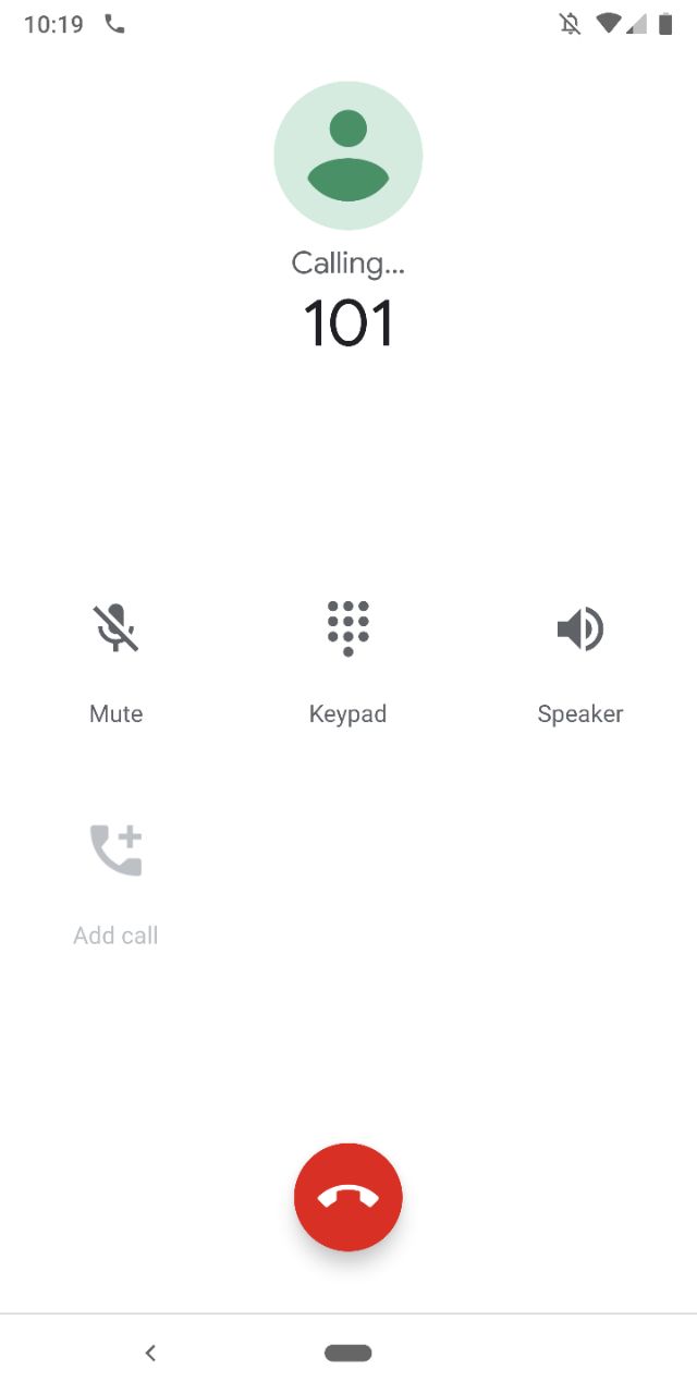
The refresh in the phone app is using softer colours overall, with the biggest change I noticed was the new screen when making a call which has changed from blue to a stark white and the font has changed slightly.

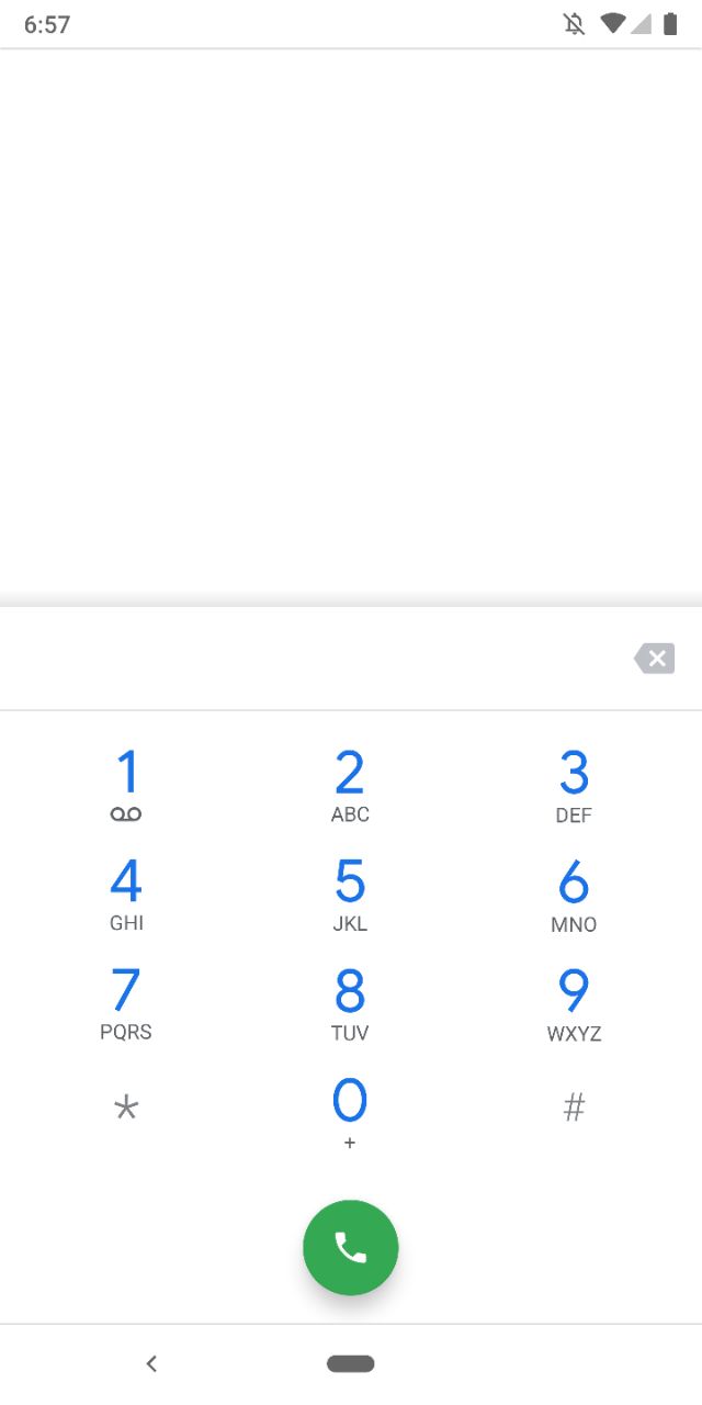
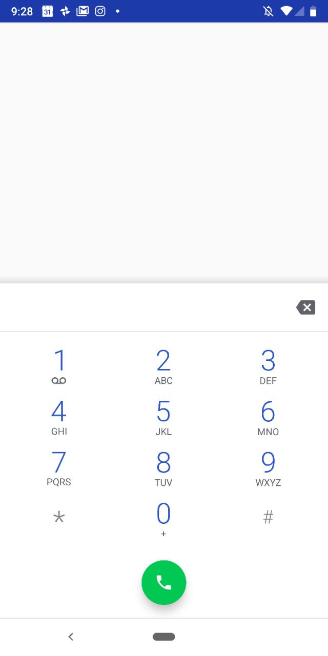
The dialpad has also seen a slight refinement with a cleaner, slightly clearer font used and the green dial button has had the tone changed slightly in tone to a more pastel shade in keeping with the rest of the visual update.
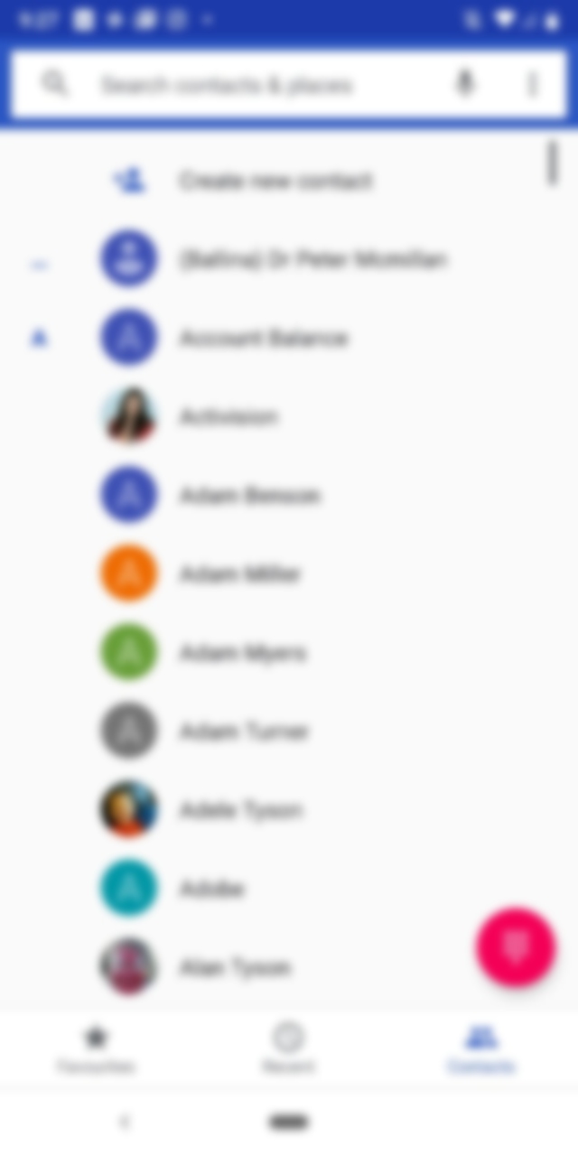
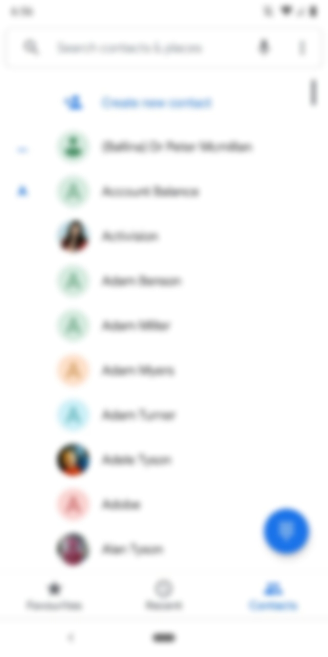
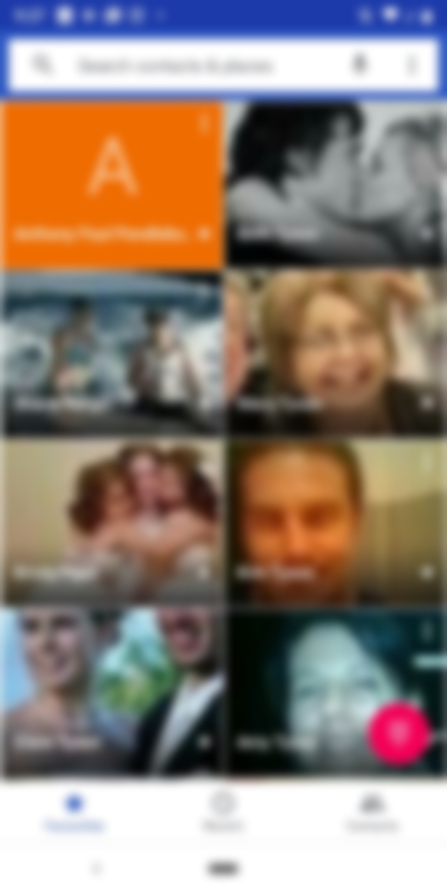
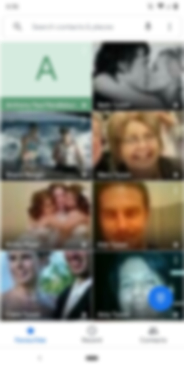
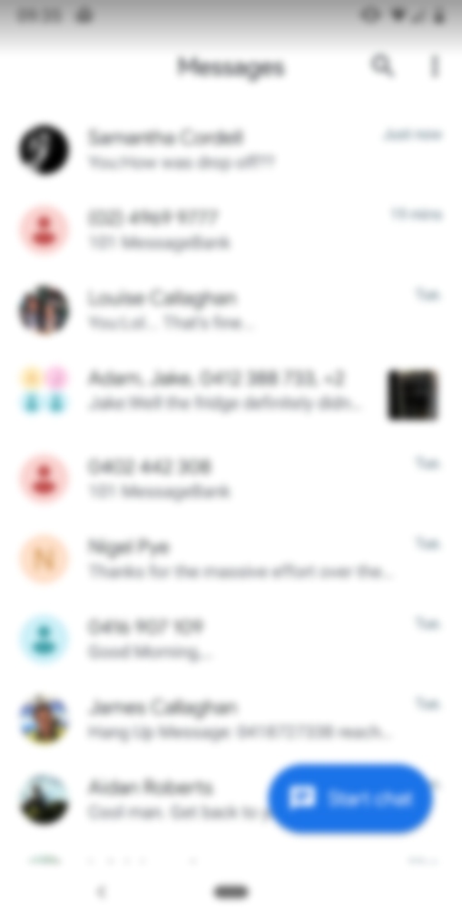
The icons for contacts which you don’t have a photo attached to in the Favourites and Contacts tab have also gotten a softer more pastel look to them, and they’ve done away with the Blue highlight around the search box. The Floating Action Button to bring up the dialpad has also changed from a bright red to a blue.
Finally, the update has also seemingly rolled out to the Android Messages app, with the pastel contacts now showing as well. The icon used for a group message has also picked four seemingly random pastel colours to be used to differentiate different participants.
The new updates are available in Google Play, so make sure you update your apps and see what you think.