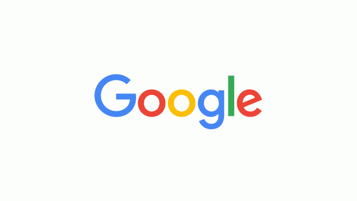
With the move to their own company under the parent Alphabet, Google has today announced a new logo to go with the transition, showcasing evolution as befits the companies journey over the last 17 years.
The new look logo will be rolled out across all the companies products soon, replacing some of the well known icons like the blue mic icon will now become a four-coloured G.
Today we’re introducing a new logo and identity family that reflects this reality and shows you when the Google magic is working for you, even on the tiniest screens. As you’ll see, we’ve taken the Google logo and branding, which were originally built for a single desktop browser page, and updated them for a world of seamless computing across an endless number of devices and different kinds of inputs (such as tap, type and talk).
How long this logo will stay around for is anyone’s guess, Google is an ever changing and evolving company, which is where their flair for innovation and addressing new problems and markets comes from. You can watch the evolution of the Google logo in this video:


