Google Maps is a major part of many of our lives, for me, it adorns my dashboard every time I’m driving, even between common destinations. Today Google lifted the lid on a visual refresh they have been working on for maps across desktop, Android and iOS.
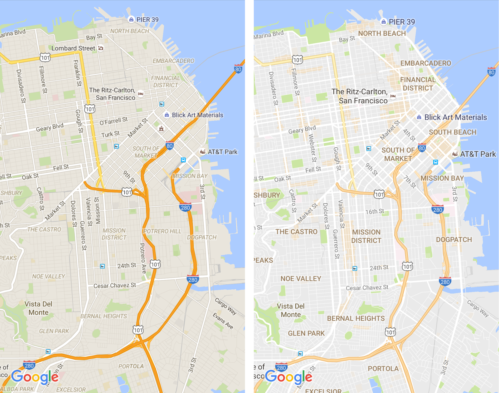
With the increasing amount of information being added to Maps that Google is constantly balancing the visual look of the interface with the desire to make it more useful and relevant. Today’s update is an attempt to achieve that balance, by adopting a cleaner look Google is hoping that important information will be easily identifiable without making it visually distracting.

The new version has had the street outlines removed to ‘lighten’ the overall look and reduce visual distraction. The typography on the map has been improved to make certain types of information such as street names, points of interest and transit stations. The overall goal is to reduce distractions and increase usability.

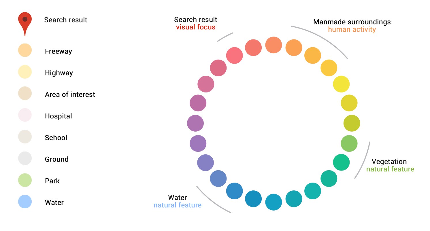
Alongside these changes the colour palette has been changed to incorporate more subtle colour scheme as well as a deeper colour coding of elements on the map. Overall these changes combine to create a lighter softer looking interface than we are used too.

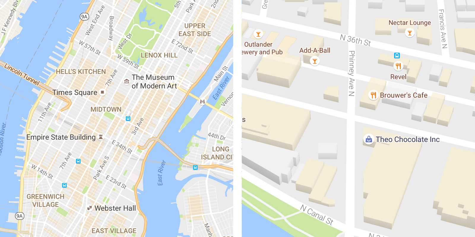
The final change is actually quite brilliant. How can you express at a wide view that the map contains additional details for specific locations? Obviously with orange. In the new interface any area lightly shaded with Orange indicates that it is an area of interest”, meaning there is more detail about that local if you zoom closer in. It’s a simple and elegant way fo visually informing users that there more information available if you zoom closer in.
Google determined the “areas of interest” using an algorithm that highlights the areas with the highest concentration of restaurants, bars and shops. In high-density areas like NYC, they use a human touch to make sure we’re showing the most active areas, check out the video below.
The update doesn’t seem to be live right at this time, but should appear on mobile and desktop soon.
Do you like the new look and feel of Google Maps? Let us know below.


