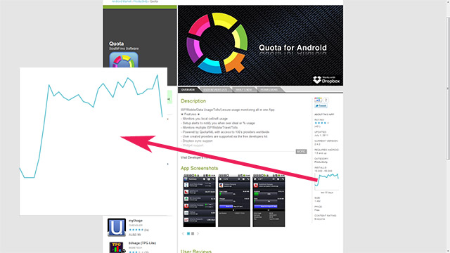
Google has been constantly working away at the Android Market web store to ensure that there’s enough functionality for both users and developers. Their latest addition to the web store is the 30 day install graph, which gives you a rough idea of how many times the particular application was downloaded and installed over a one month period.
This is a great tool for users and developers to see how popular their application was after a new update was pushed and to show a slow down in installs if their app becomes outdated or useless. The graph is of course generated by Google’s Chart API . We’d like to see additions to the web store, such as this graph, also added to the Android Market application for devices. What do you guys think of the graph, is it more for developers to gauge user response?


