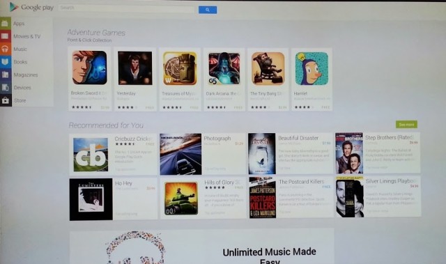

One of the many Google Play-related announcements at this year’s Google I/O conference was that the web-based Play Store would be receiving an updated design to match its mobile counterparts.
Droid Life has published some images today that look very much like that updated Play Store, saying it’s being tested internally at Google and looks like it’ll roll out in the next few weeks.
The design looks almost identical to the tablet UI for the Play Store, which makes sense since your computer screen is also a large, landscape display. It’s really nice to see a consistent design style emerging across all of Google’s services both on the web and mobile, and I’m curious about how influential the card-based design will be on newer versions of Android.


