
The Google Play store web interface has been updated a short time ago, the new interface is very familiar and in keeping with the ‘card theme’ that Google has been pushing with Google Now.
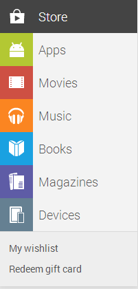
The new menu system on the left hand side mirrors the updated Play Store Android app which surfaced just prior to Google IO in May. The new design is quite refreshing and clean, the sections are a little more prominently displayed as are the ‘Wishlist’ and ‘Redeem gift card’ sections.
Users will notice that the card them has also brought about a small restructure in the front page display. Recommended items are a mix of books, apps, music and magazines suited to the purchases you’ve already made and the other lists as you scroll down the screen is much more comprehensive than ever before.
What do you think of the new UI? Is anything you want to see missing, or have Google nailed it? Let us know your thoughts in the comments below