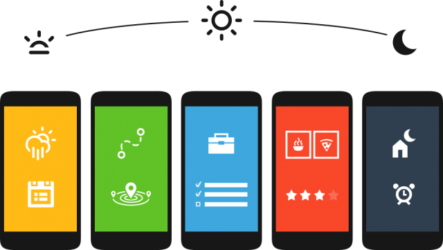
Most custom launchers are variations on a theme – static rows of icons with the occasional widget thrown in depending on your taste. Aviate takes a different approach, offering dynamic content that changes depending on your location, the time of day and a million other factors that I’ve only begun to discover.
If you read other Android blogs (GASP! There are other Android blogs?) you’ll likely have seen everyone going crazy for Aviate for the last few months. Not Ausdroid though. We’ve been trialling Aviate for a while now, but frankly, its alpha version was nothing to write home about – after all, we could make a full-time job out of writing up a post each time some developer churns out a half-baked homescreen concept. But Aviate has continued to develop and now that it’s hit beta, it’s actually reached a point where it actually offers something over other launchers on the market. Unfortunately, it’s still invite-only, but if you sign up it shouldn’t take too long to get invited.
Design
Aviate makes use of design elements common to other Android applications – there’s the slide-out navigation drawer complete with the hamburger symbol, the particular shades of white and grey used in the light theme are decidedly Google, applications are sorted into trays that look much like Google’s cards – but made some changes to everything and ended up with a result that just doesn’t look or behave quite as it should.
That’s not to say that Aviate is ugly, though – it just puts its own spin on Android’s style for better or worse.
Home screens
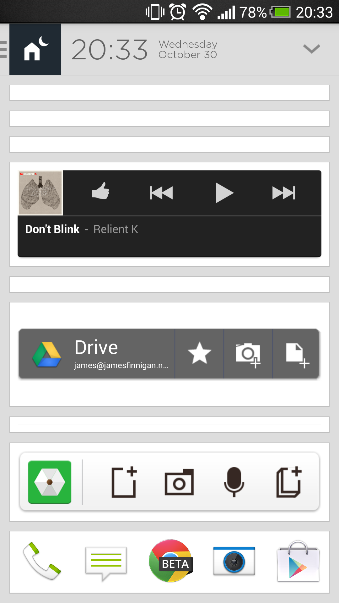
Aviate will give you four pages of home screen, and very few customisation options. The default, or ‘home’ screen, if you will, has a clock up the top and a two-row dock across the bottom of the screen with space for ten icons. In the middle is where your widgets live. There is seemingly no limit to how many widgets you can put on this screen, but there really should be. You basically have a 4 x 4 grid, which doesn’t scroll vertically and so if you add more than one or two widgets, they’ll collapse up and you won’t be able to see anything. I find that two 4 x 2 widgets is the best approach – I use Today and Google Keep, but any other 4 x 2 widgets will work just as well. It’s worth nothing though that there is no way to resize individual widgets. It is very much an all-or-nothing system and this is one of the things I hope gets a sprucing prior to the public release.
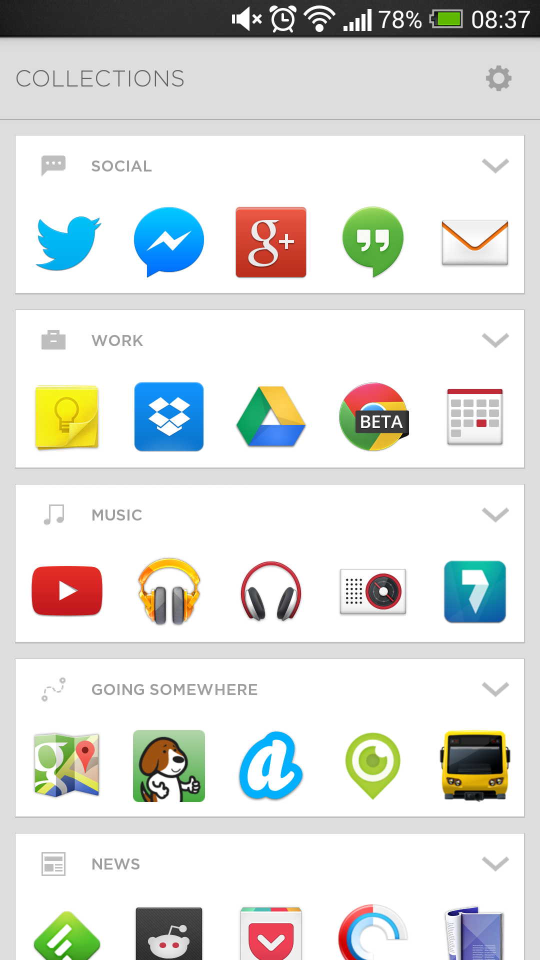
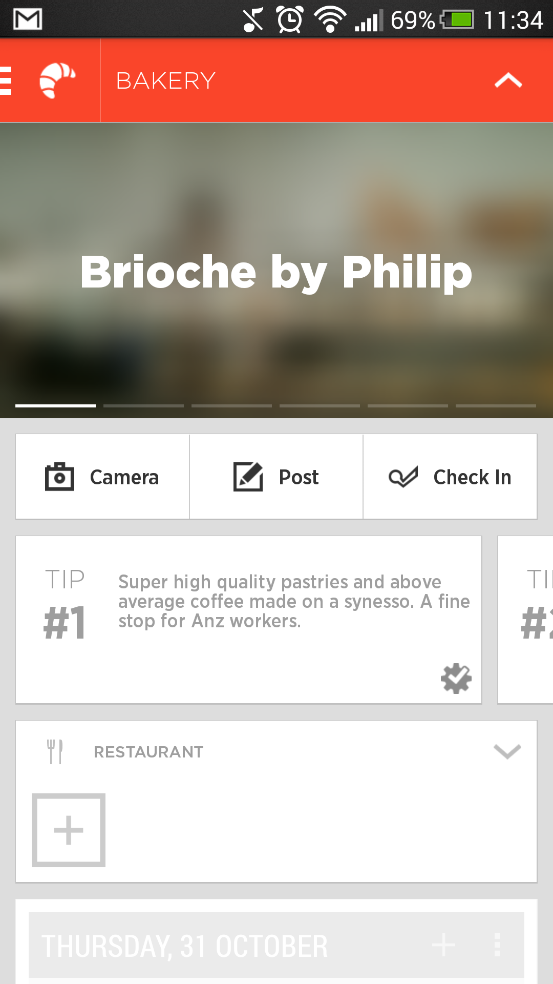
Swipe to the left of the ‘home screen’ is where you’ll find the settings menu, as well as a neat way to switch between ‘spaces’, which we’ll get to in a moment. To the right of the home screen is the ‘collections’ page, which contains groups of applications automatically sorted by category. For instance, sorted into the ‘social’ collection are apps like Twitter, Google+, Facebook, Hangouts and Reddit Sync. Aviate does a pretty decent job of sorting apps into these collections, but sometimes it’s a bit off – I wouldn’t really categorise WordPress as a social app, but there you go. We have no idea on what basis the applications are sorted.
 |
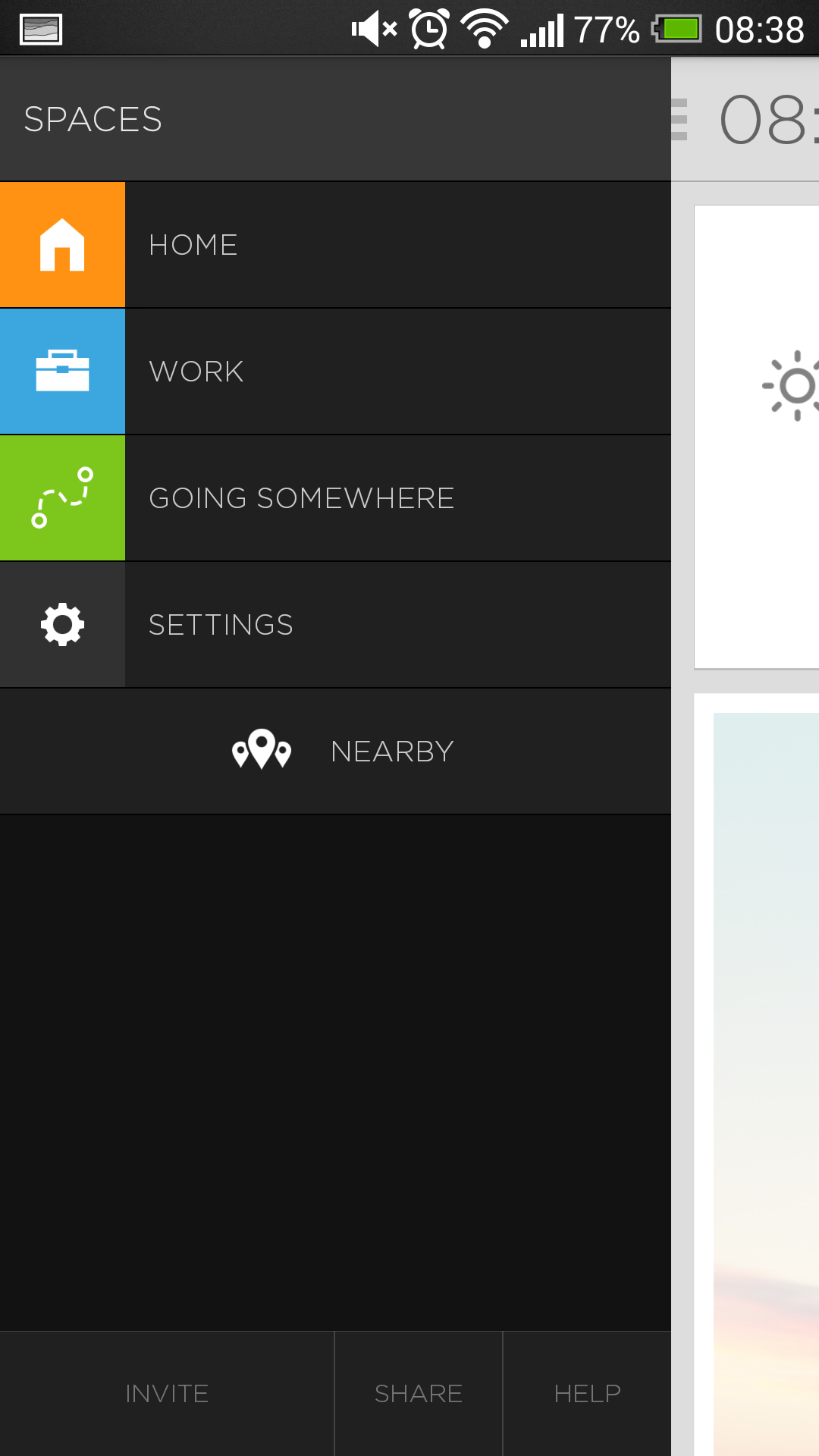 |
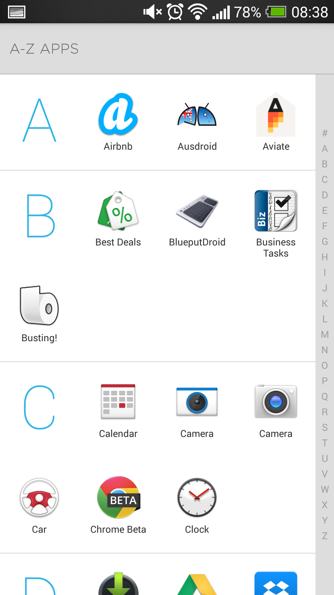
You can obviously select which collections are displayed, but unfortunately you can’t create your own custom collections at this stage, nor can you rename existing collections. You can add and remove applications from each collection though, so that’s something. Aviate doesn’t have an app drawer as such, rather it has a vertical-scrolling list of all your applications on the rightmost screen.
Dynamic homescreen
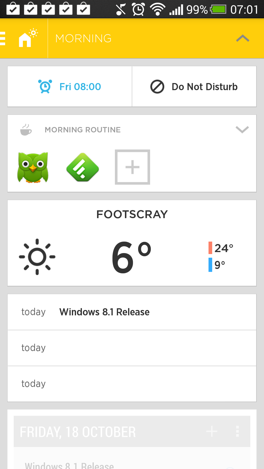
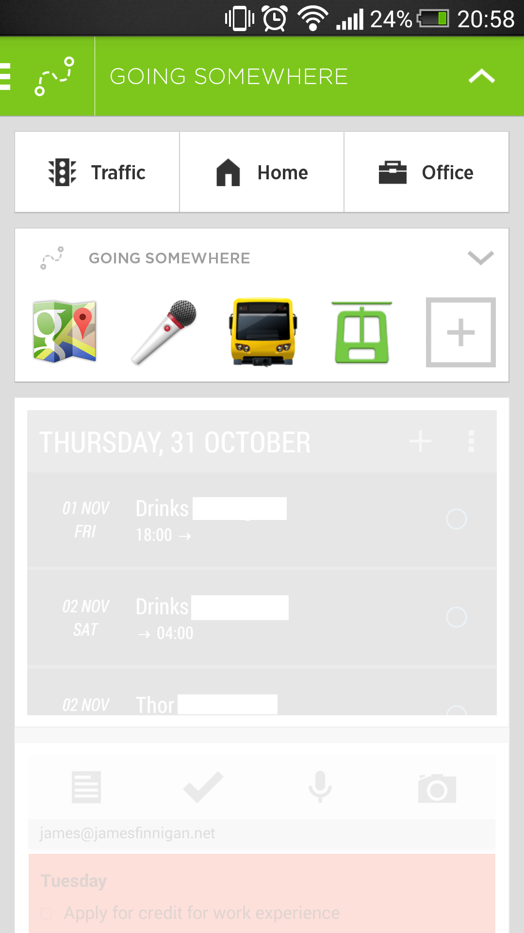
In addition to the widget space on the home screen, tapping on the down chevron at the top of the screen (or simply just pulling the screen down) will load up another area filled with widgets and applications, depending on context, which are known as ‘spaces’.
Spaces are probably Aviate’s most appealing feature. So much of what we do on our phones will depend on where you are or the time of day, and Aviate tries its best to put the things you might want to do in front of you at the right time.
 |
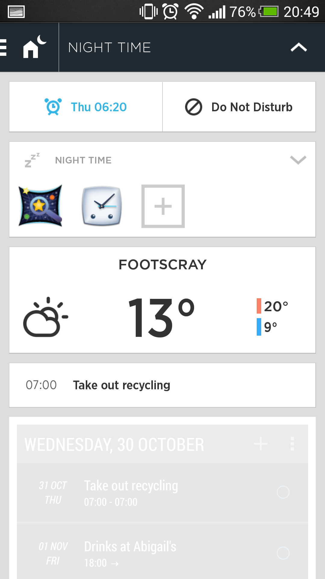 |
For instance, when it’s dark out, Aviate presents me with my alarms for the next morning, as well as ‘night time’ applications. In the morning, I’m presented with shortcuts to Feedly and Duolingo as my ‘morning routine’. As I mentioned, the spaces are contextually aware, and changes are triggered by your location and the time of day. My favourite trick is when Aviate figures out that I’m in transit and gives me quick links to check traffic, or directions home or to work. Just so there’s no confusion, Aviate always shows a little icon in the action bar to let you know what screen is currently loaded.
 |
 |
What’s missing / could be improved
Customisation! At the moment, you can’t add more home screens, (realistically) add more than two widgets to your home screen, set a wallpaper, or create and edit collections. Aviate’s ability to automatically switch spaces depending on your location is fantastic, but I can’t but think that it could be better.
It would be neat if you could create entire home screen configurations for each space. So for instance, you’d be able to configure a set of widgets and application shortcuts for various places, which would switch automatically. Aviate would know when you’re at the gym or at home, and automatically show the appropriate space.
To help with customisation, it would be nice to be able to remove Aviate’s built-in widgets, which you can’t currently do. There also isn’t landscape support, which may not be a problem for you, but it’s always nice to have the option.
I’m not sold on the removal of the application drawer either. I like having quick access to all of my applications from anywhere in the launcher, and Aviate keeps the Windows Phone-eque application list a couple of swipes away at the far right home screen.
So far, I’ve not run into any significant performance issues or buzz-killing bugs so far, so at this stage it seems likely that Aviate’s developers are working hard on rounding out the application’s feature set.
Conclusion
Aviate works well for what it does, and I have faith that the developers will fix some of the issues I have with it before it’s released to the general public. Aviate is a good-looking, minimalist launcher which requires little-to-no maintenance to keep functional. If you like loading up your home screens with widgets, this launcher probably isn’t for you, at least not yet. The concept is amazing, but it’s still a little too early to come to a definitive conclusion about Aviate.
Personally, I can’t give up BlinkFeed, so for now at least I’m sticking with the stock HTC launcher. But if you’re looking for something different, I’d suggest giving it a try when you get the chance. Aviate is available as a free beta on the Play Store, but will require an invitation code, which you can get by signing up at their website or within the application.
[pb-app-box pname=’com.tul.aviate’ name=’Android App Aviate Beta (Invite Only) on Playboard’ theme=’discover’ lang=’en’]


 — Australian Review")